Mountain Web
Brand Identity
Firm Lawyer
Identity + Logo
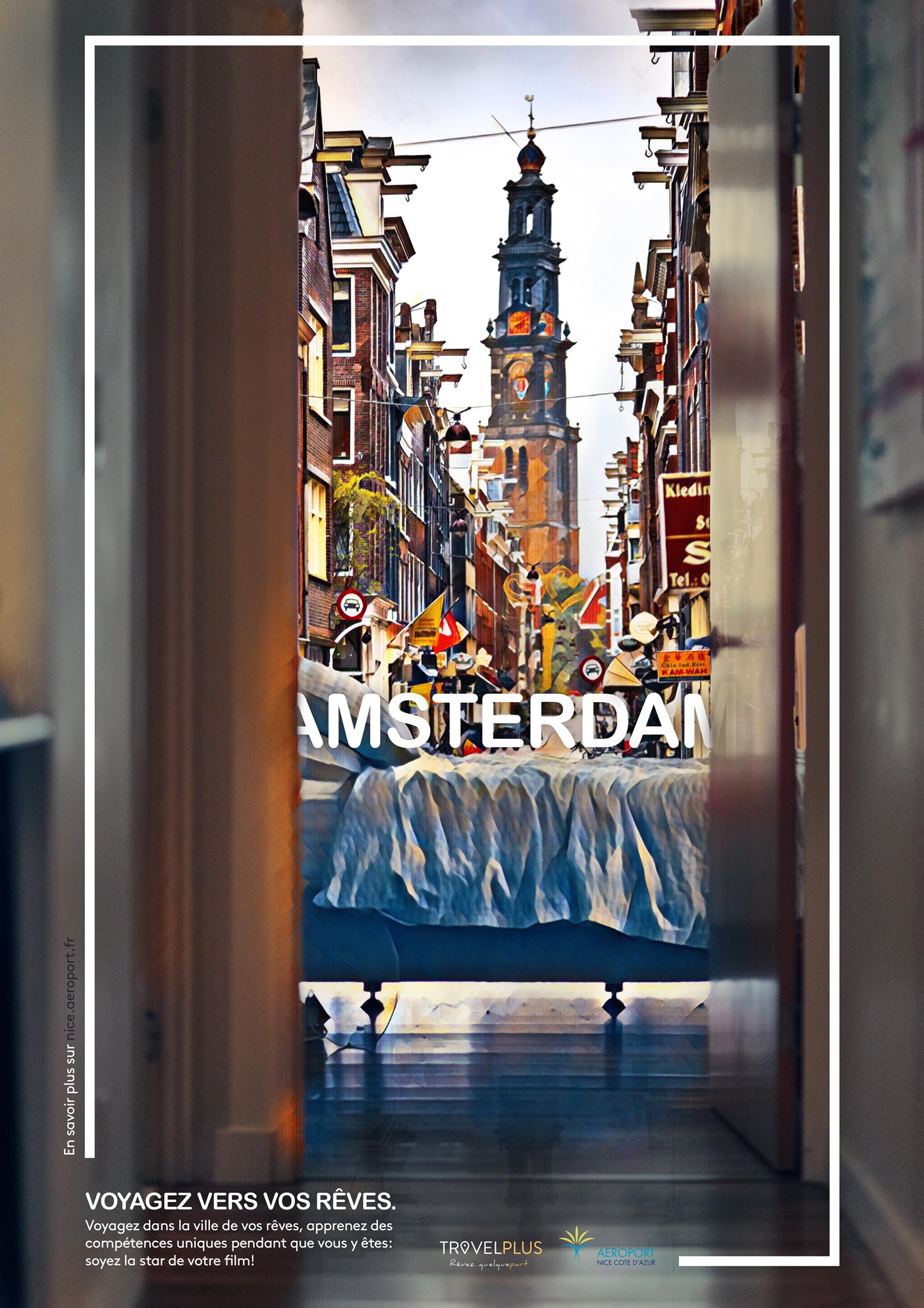
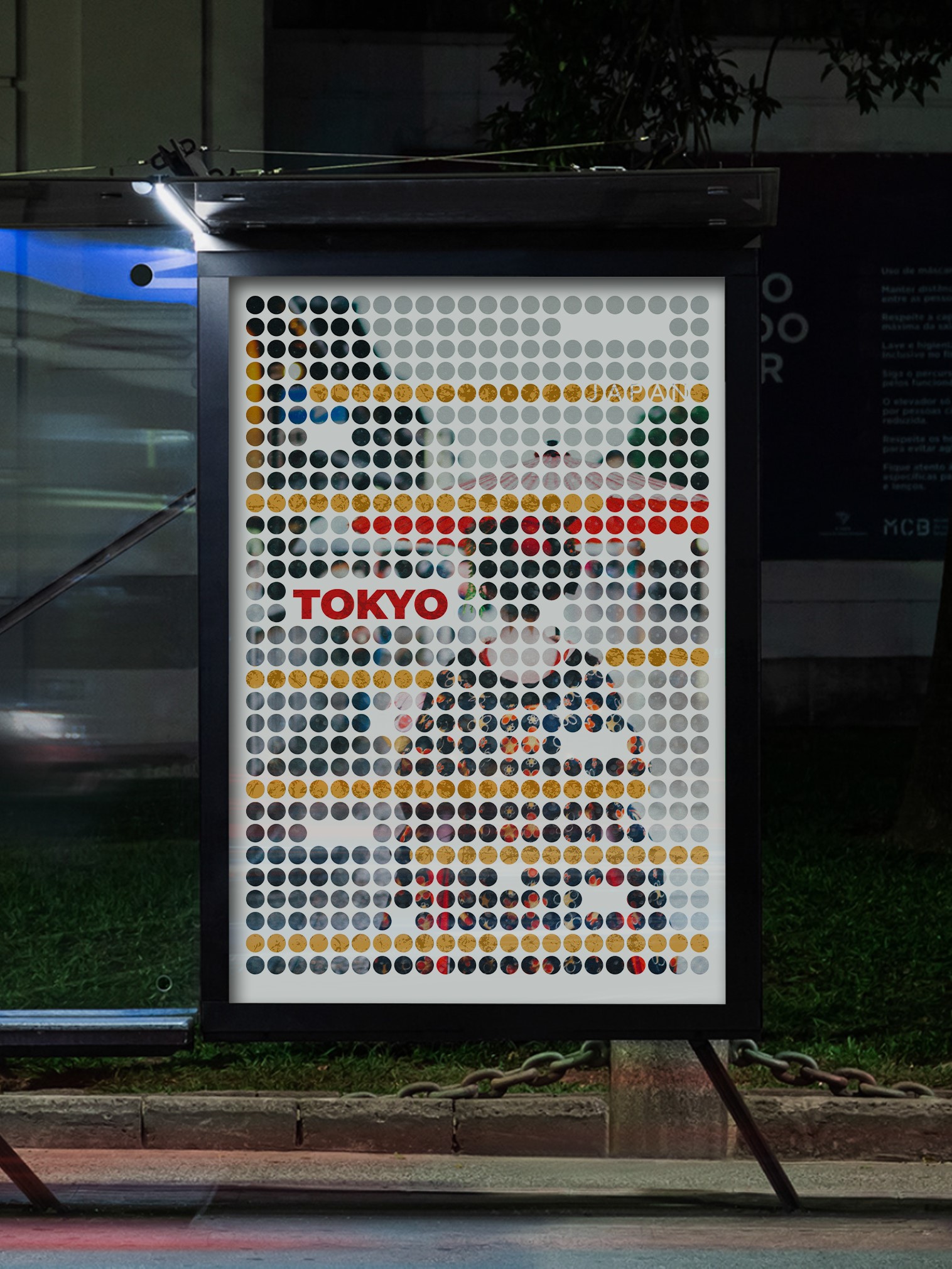
Travel+
Ad Campagin + Poster

Colectio
Identity
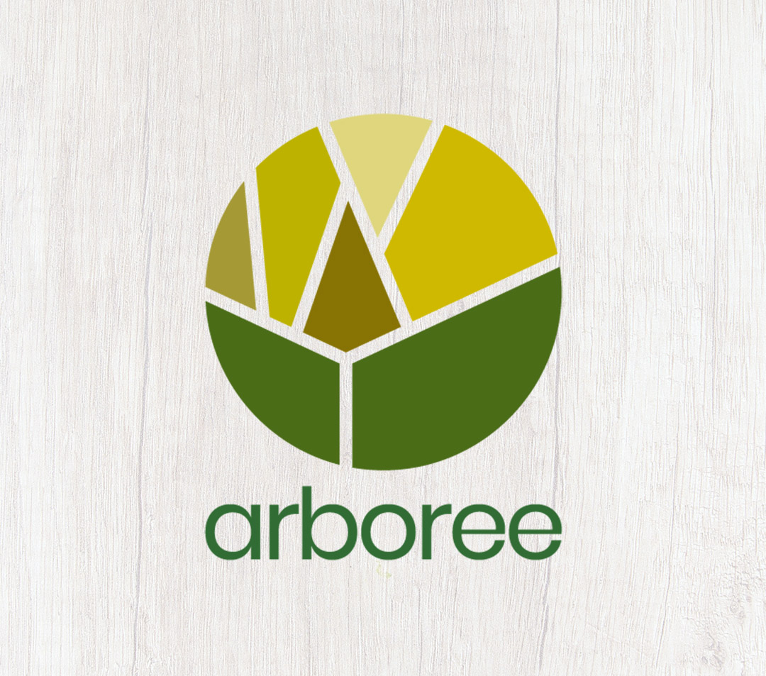
Arboree
Identity + Photography
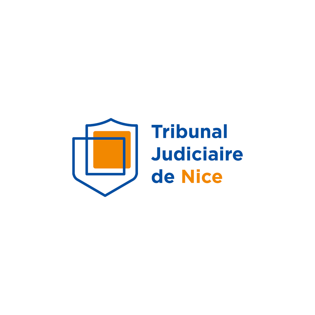
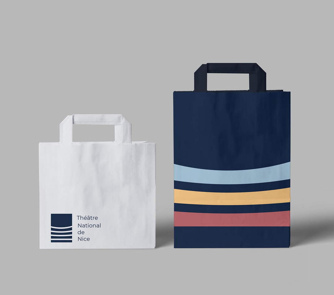
Tribunal judiciaire de Nice
Proposed Identity
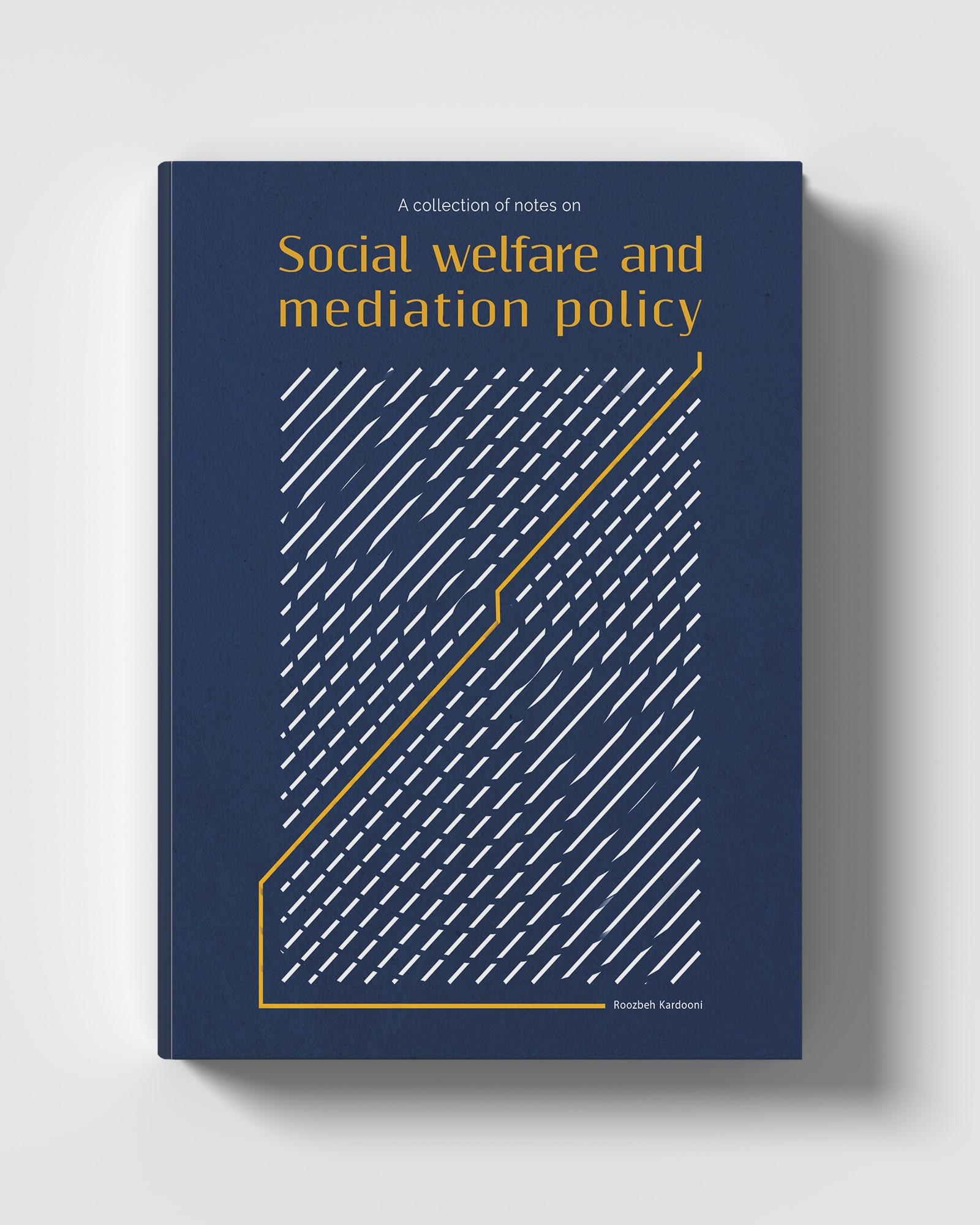
Social Welfare
Book Cover Design
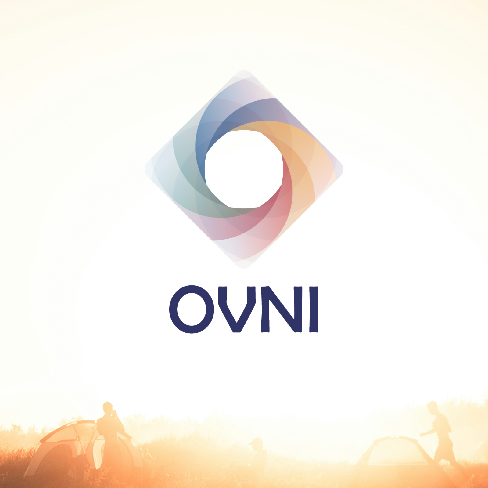
OVNI Festival
Identity + Poster + Print
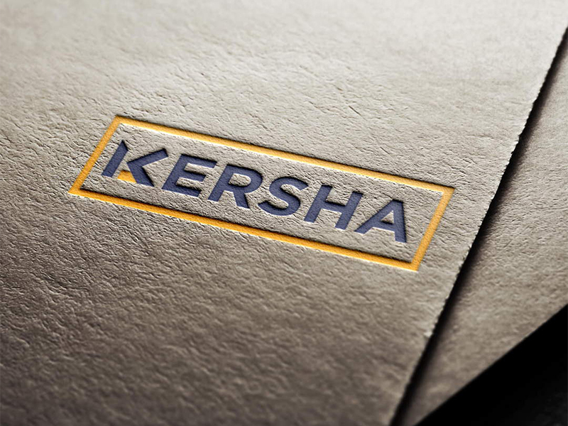
KERSHA GROUP
Identity + Print + Web
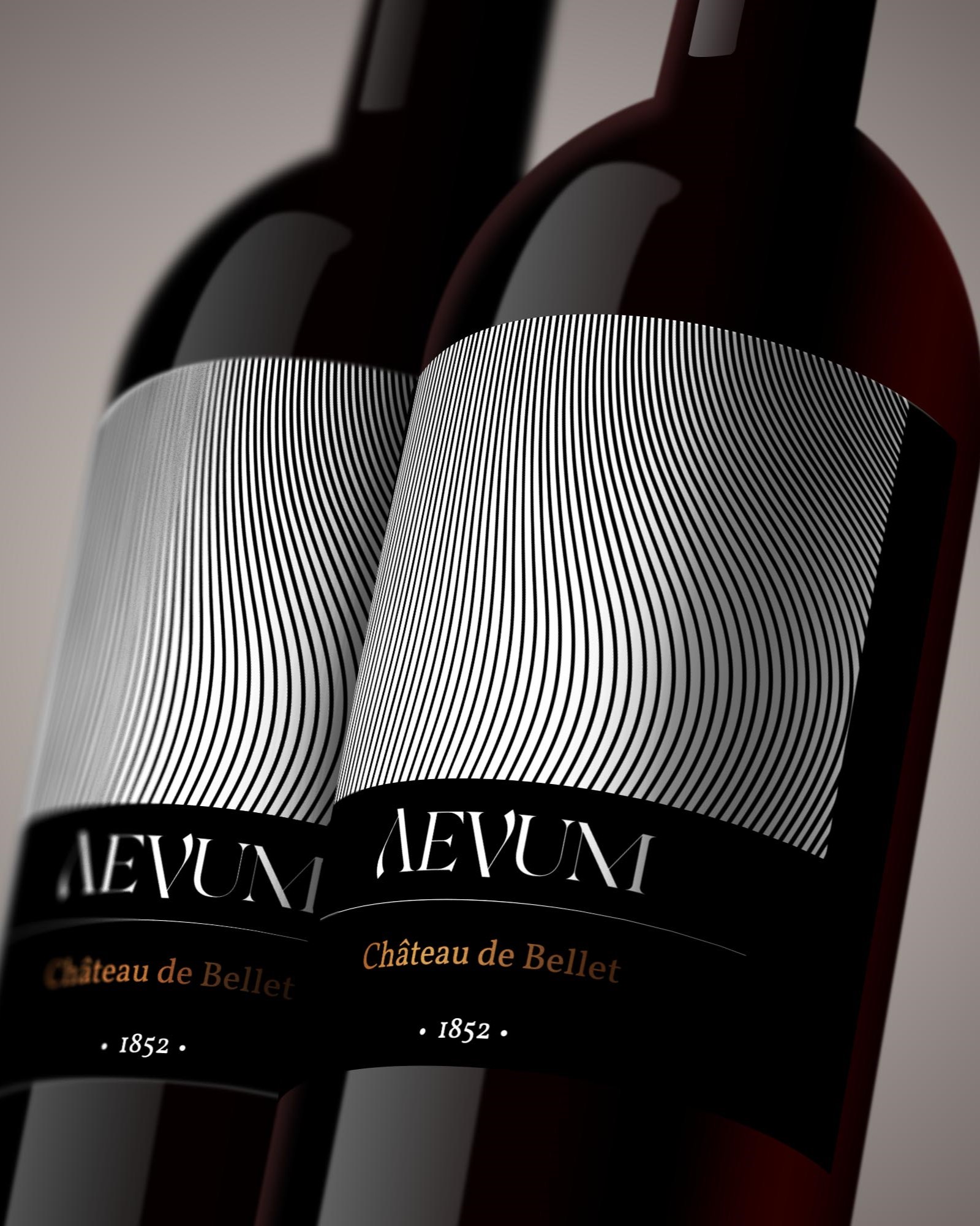
Aveum
Identity + Label
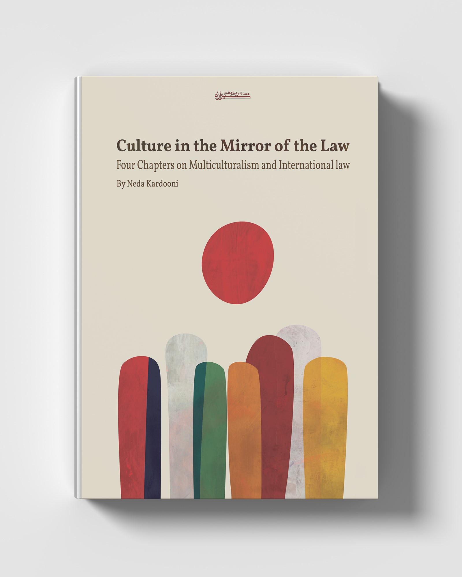
Culture in the mirror of law
Book cover design
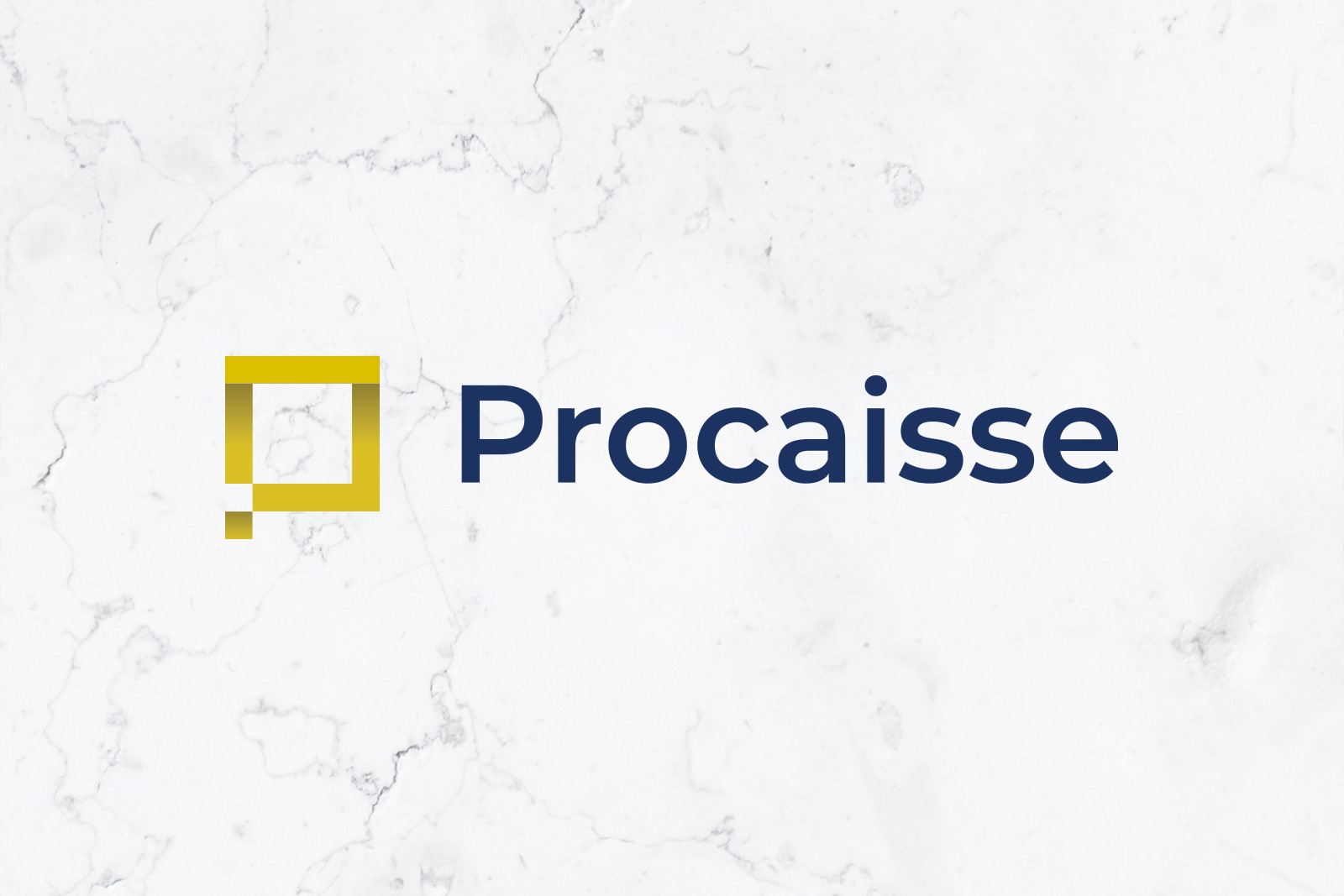
procaisse
Identity + Web Design
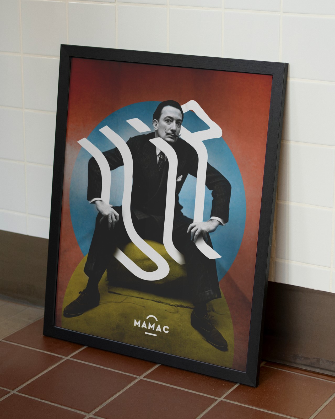
Dali Exhibition
Poster Design
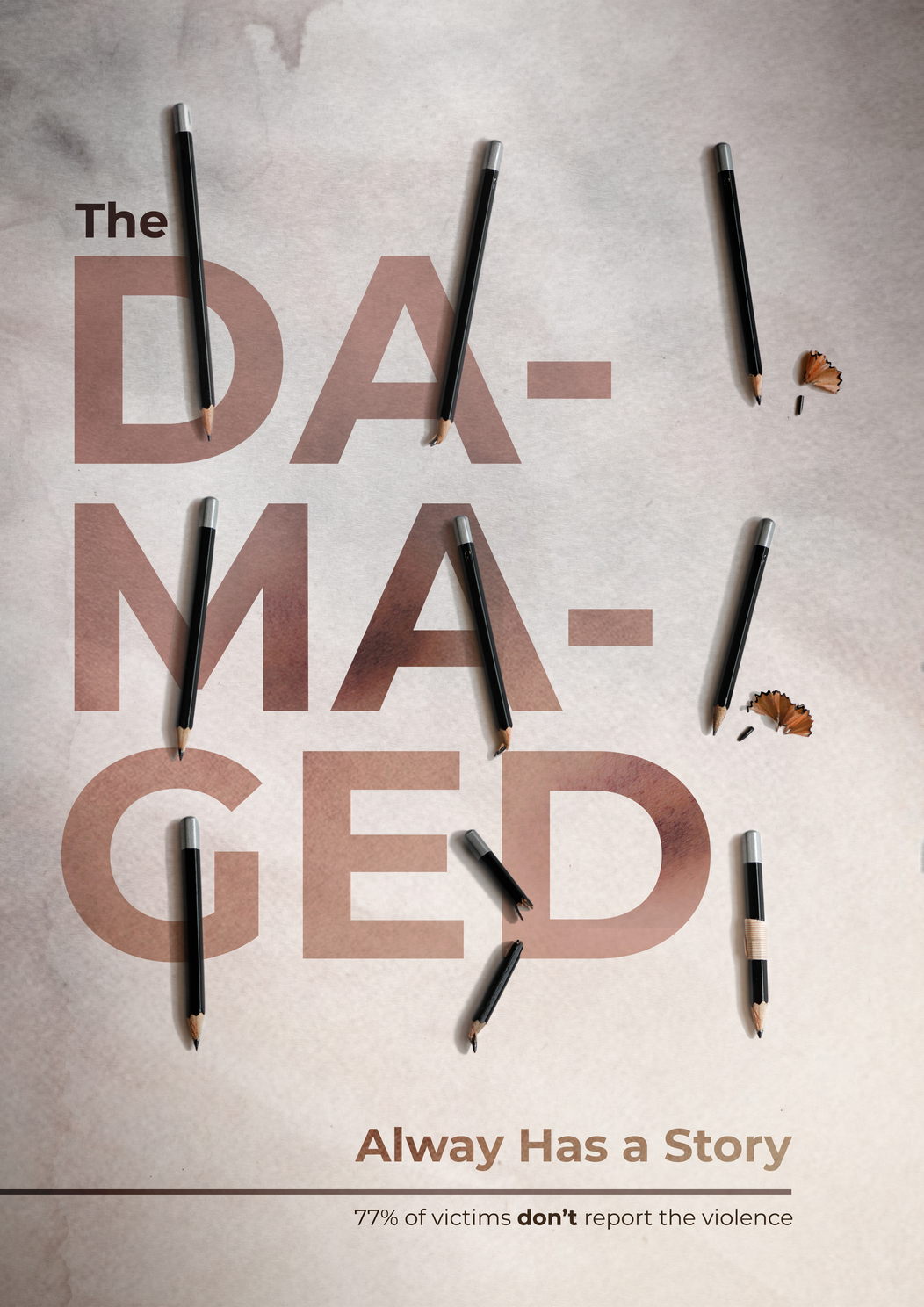
Anti-violence Poster
Personal project
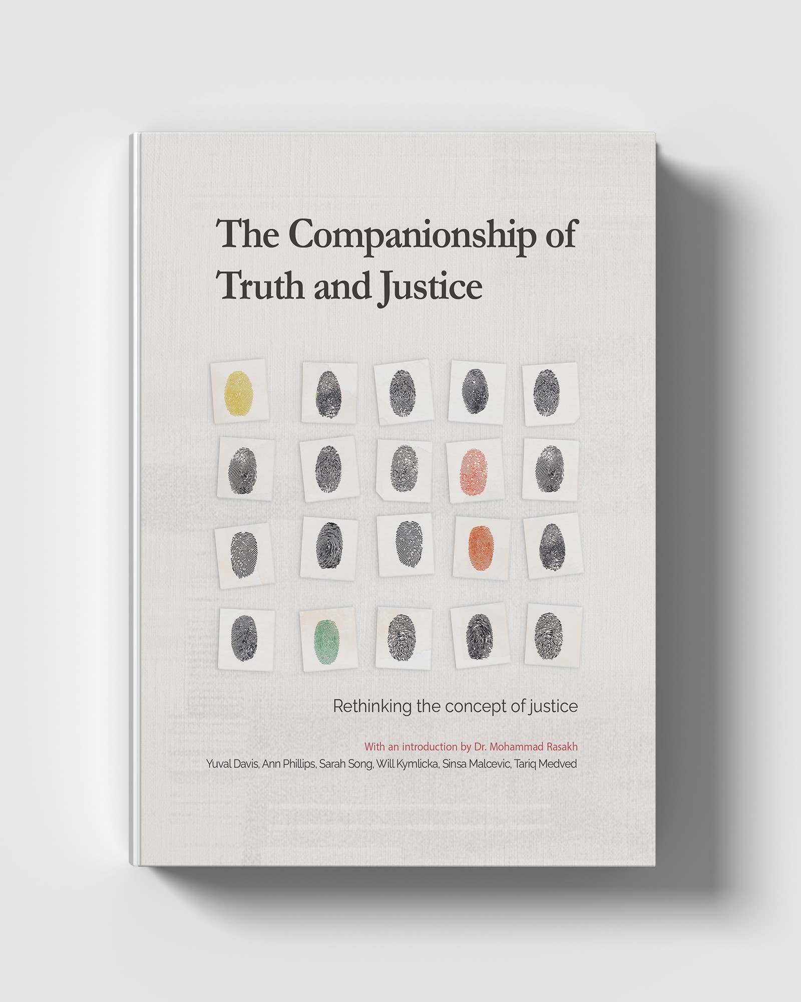
The companionship of truth and justic
Book cover design
Théâtre National de Nice
Proposed project
Cosmetic Clinic
Identity + Logo
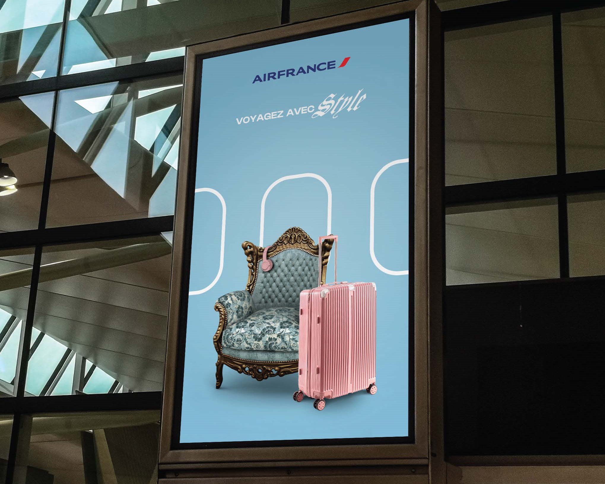
Airfrance ad campagin
Proposed advertising campaign
Musée du Palais Lascaris
Exhibition catalogue

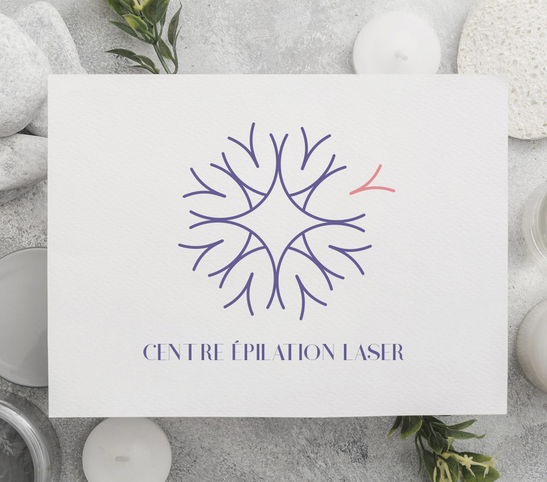
Acupuncture Clinic
Identity + Logo
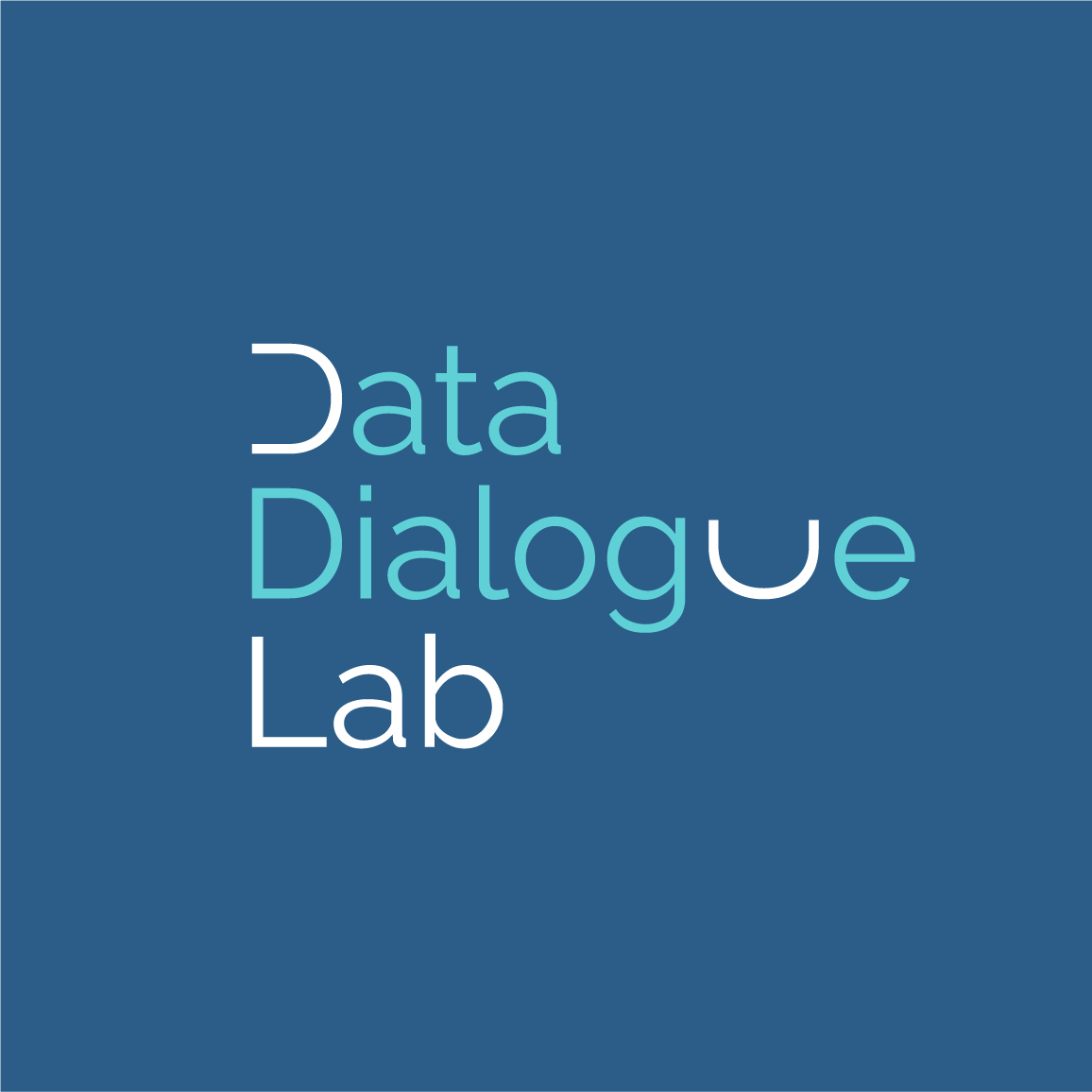
Data Dialogue Lab
Identity
Creative Poster
Personal project
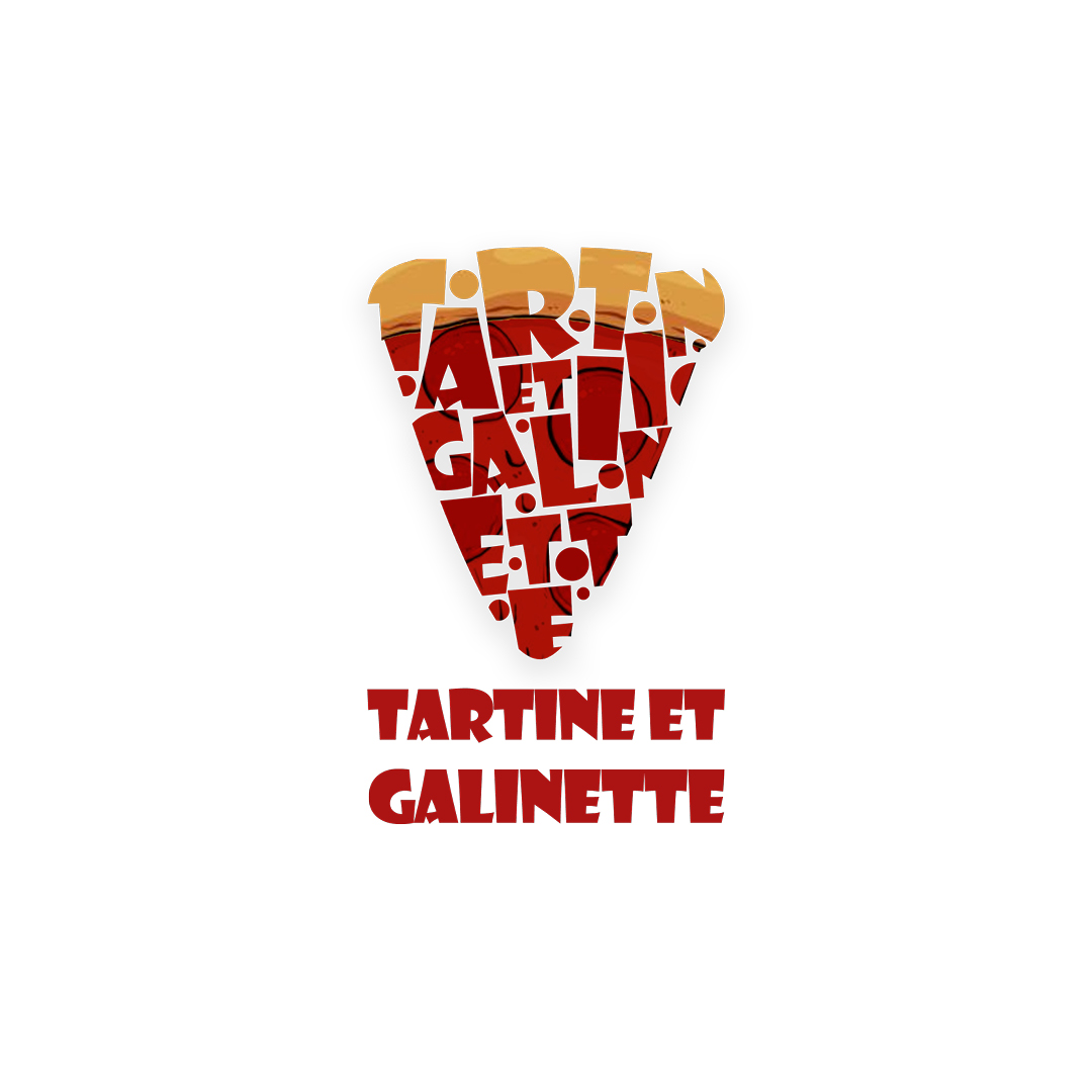
Tartinne et Galinette
Identity + Appliction Design